02.24
| LomoChrome Color ’92 - a review
| LomoChrome Color ’92 - a review
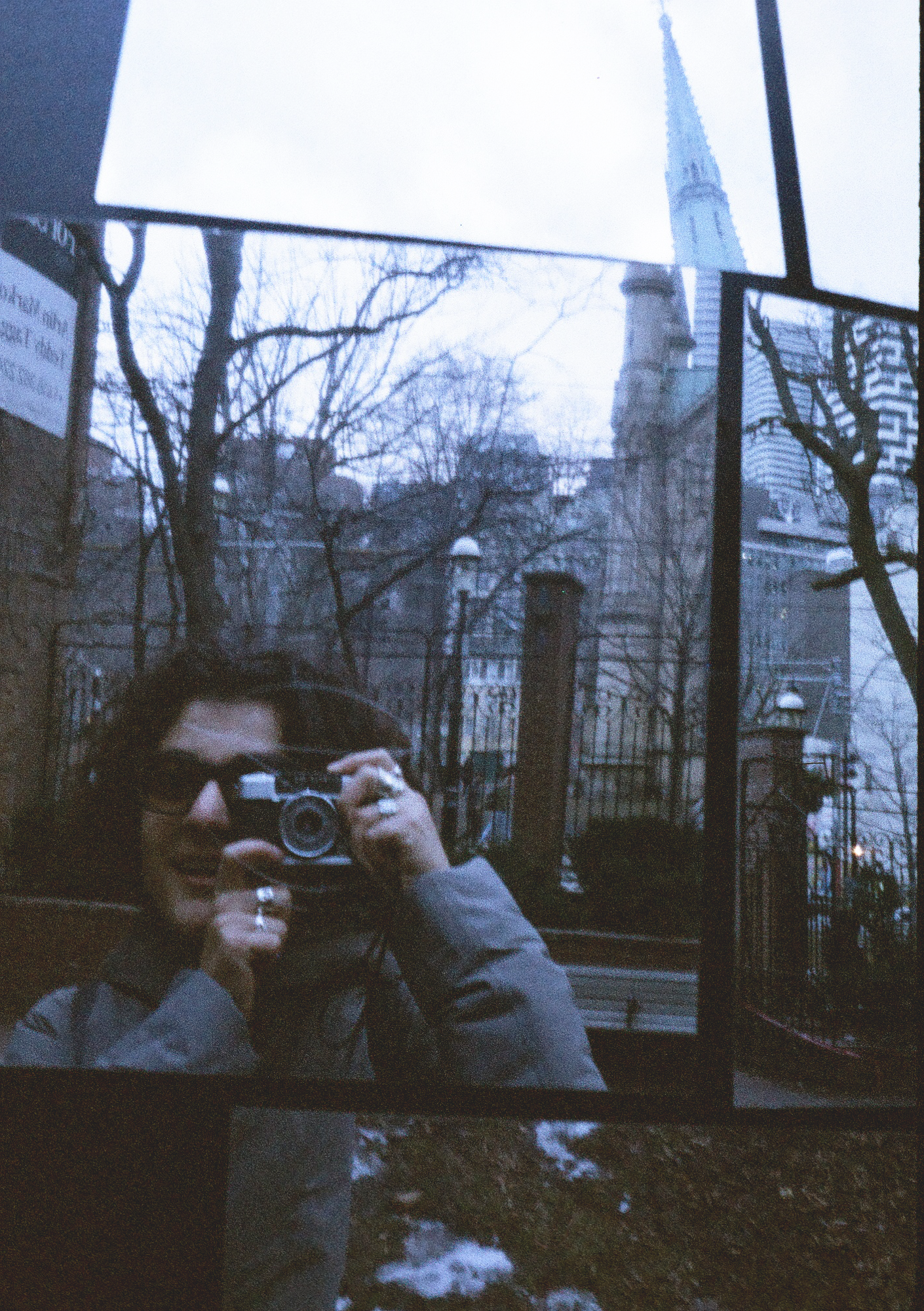
Shot on my Olympus Pen EE (half frame).
Some comparisons on how this film renders when shot in various environments at its intended exposure.
The essentials
Film Speed 400iso
Film Speed 400iso
Development Process C41
Exposures per roll 36
The look
You want every shot to be a 90’s grunge album cover.
You want every shot to be a 90’s grunge album cover.
You’re exploring Tokyo on a cloudy day. You want :
“Fascinating blue hues, vibrant reds and delicate pastel undertones.”


How I’d rate the following:
Contrast and Dynamic Range
You’ll be able to tell rather quickly that your best bet would be to overexpose your roll, or have it pulled. I’d comfortably set the aperature at an entire stop lower next time. The meter on my Olympus pen tends to account for exposure pretty accurately.
Grain Size and Structure
Taken on my half frame, there’s a more pronounced look to the grain structure. I’d argue that’s more the point to this film than a side effect, it really suits the bleached grunge look.
Versatility
Yeah, not at all suited for indoors. I bet this film with flash would be worth testing out to get a proper exposure, even outdoors.
Would I shoot on this again?
I would! It’s a pretty trendy style at the moment and used with intention, each shoot really delivers something with impact. As an important bonus, I could easily correct the tone on these shots in Photoshop, reducing the cold blue cast on shots where I felt it wasn’t suited. (Examples of that towards the end).
Example shots:
 ~10am, wasn't anticipating this extreme a contrast/ shadow
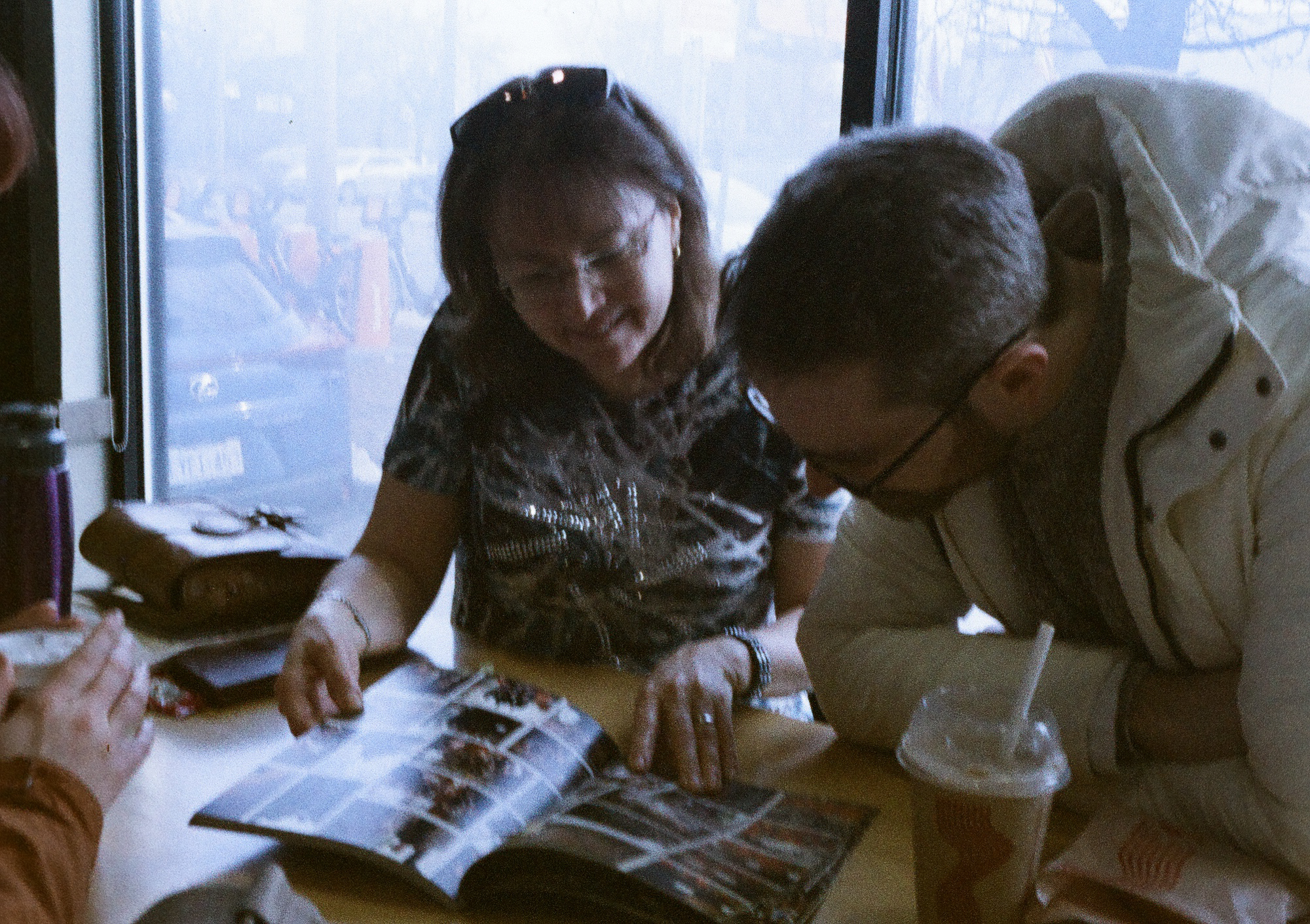
shooting indoors.
~10am, wasn't anticipating this extreme a contrast/ shadow
shooting indoors. A good example of saturation strength with warmer hues


With colour correction:

 Love the sandy tones once colour corrected
 Love how the greens and nude tones come through once colour balanced in post.
